Get new posts by email or rss feed
Also posted to Reddit in r/diabetes and r/QuantifiedSelf. Check those out if you want to see/participate in the discussion.
A couple weeks ago, u/NeutyBooty posted on how hot showers caused their blood glucose to rise. Lot’s of commenters confirmed the general observation, but for some it appeared to be a CGM artifact, for some it matched their finger-stick meter, and others they see a BG drop.
To figure out what’s really going on, we decided to do a communal self-experiment. Over the past two weeks, 8 Redditor with diabetes have been measuring their blood glucose before and after showering. So far, we have 22 measurements, so I thought it would be useful to post an initial exploratory analysis of the data to see if the wider community had an insights or suggestions.
In the comments, please chime in with any thoughts, additional analyses, or questions. If there’s any graph, calculation, etc. you’d like to see, let me know and I’ll add it. We also need more experimenters, so if your interested, let me know.
Highlights:
- Initial indications are that we are seeing a real and consistent increase in BG from hot showers, not a sensor artifact.
- So far, we are not seeing a clear person-to-person variation in the effect (more data needed).
- There’s some very tentative but interesting trends in the data:
- The effect is stronger with lower initial BG
- The effect varies with time of day (could easily be a confounding variable here)
In order to get a clear answer on person-to-person variation and to better pull out any correlations, we need more data, especially repeat data from more people. If you’re interested in joining the experiment, let me know.
Details:
Design/Methods
Protocol here. All data was converted into consistent units and put into an excel spreadsheet. From the raw data, I calculated change in BG from start of shower, as well as the largest relative change, and the time until largest relative change (see spreadsheet for calculation details). Visualization was done using Tableau.
Data
Results & Discussion
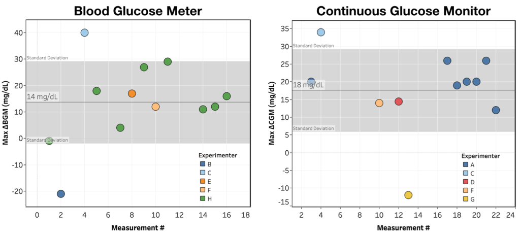
First, let’s look at the big question: are we seeing an effect? For this question, I plotted largest observed change over the 1 hour monitoring period for each shower as measured by both BGM and CGM.
Looking at the graphs you can see the following:
- We are seeing a measurable rise in blood sugar from a hot shower.
- The effect is approximately the same size when measured by BGM vs. CGM, suggesting it’s not a sensor artifact
- BIG CAVEAT: We don’t have much data from people with both BGM and CGM, and the majority of data is coming from two experimenters, so this conclusion is very tentative.
- We’re not (yet) seeing a clear person-to-person variation. For both BGM and CGM, with the exception of 1 outlier in each case, there’s a pretty consistent increase in BG after a shower.
Interestingly, while we consistently see an increase in BG after showering, the timing of that increase is much more variable. If instead of looking at Max ΔBG over the monitoring period, you look at ΔBG 15 minutes after the shower, you get:
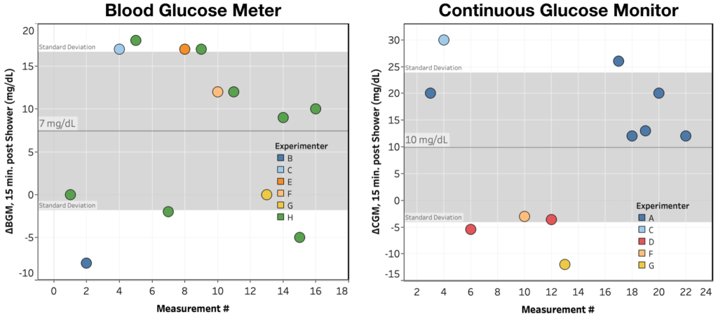
While we still see the effect, it’s a a lot more variable, especially in the BGM measurements.
Next, even though there’s not enough data for solid conclusions, I thought it’d be interesting to see if there was any interesting patterns/correlations in the data. I looked at:
- ΔCGM@15 min. vs. ΔBGM@15 min. – only three data points, so can’t really say anything
- Max ΔCGM vs. Max ΔBGM – two data points, can’t say anything
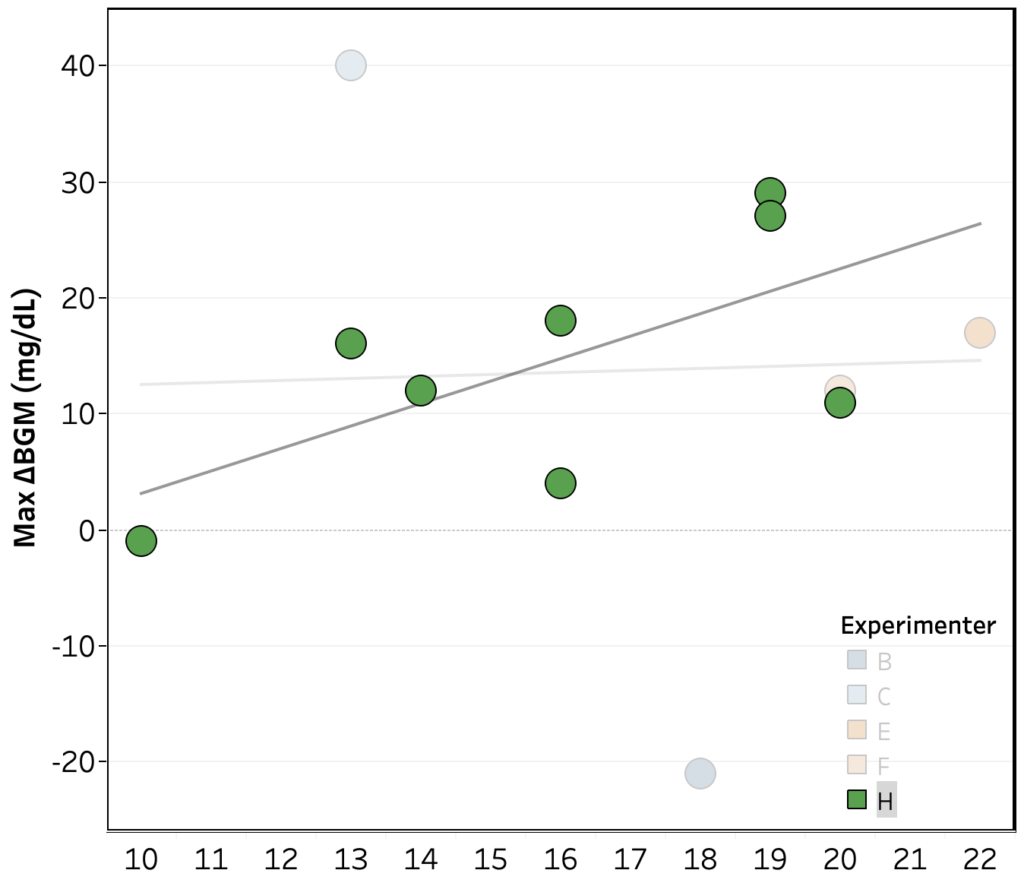
- Max ΔBGM vs. hour of the day – no trend across the whole data set, but within Experimenter H’s, there’s an indication of a greater rise later in the day (R2 = 0.40, p = 0.08)
- Max ΔCGM vs. hour of the day – no clear trend across the whole data set, nor within experimenters
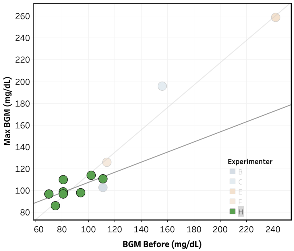
- Max ΔBGM vs. starting BGM – no trend across the whole data set, but within Experimenter H’s data, there’s an indication of a strong negative correlation (R2 = 0.57, p = 0.03).
- Max ΔCGM vs. starting CGM – no clear trend across the whole data set, nor within experimenters.